Print, Audio or Screen: Which Format Carries Which Detail?
Print, audio or screen each carry detail differently. Learn which format makes a layered news explanation easier to follow, revisit or see in action.
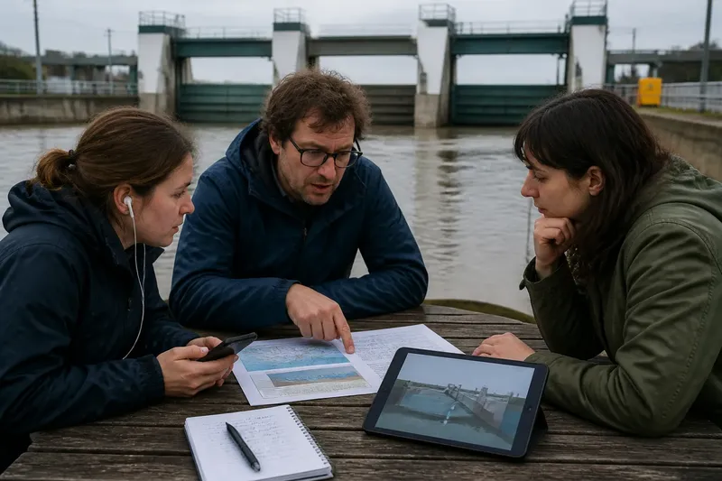
You are halfway through a news story about a river flood barrier when the explanation turns to water levels, gates and a map. Print, audio or screen can all carry the same reporting, but each asks you to handle that detail differently: reread a paragraph, hold a sequence in your ear or inspect a visual. The useful question is not which format is best overall, but which one makes each part of the explanation easiest to understand.
Detail has different jobs
A layered news explanation may need to establish a sequence, clarify a relationship, show a physical change and distinguish what is known from what remains uncertain. These jobs do not place identical demands on readers and listeners.
For example, a story about a new flood barrier might explain when a gate closes, how that affects water moving through a channel and what residents should expect. The timing is sequential; the channel’s shape is spatial; the expected effect needs careful qualification. A format can make one of these easier to grasp while leaving another less convenient.
Think of a format as part of the explanation, not a wrapper around it. The reporter’s evidence and wording still matter, but presentation affects whether you can pause, compare, hear emphasis or see a relationship. That difference becomes most obvious when several details depend on one another.
Print supports return
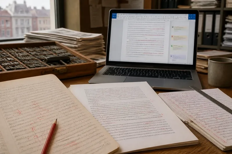
Print gives a reader control over pace. You can stop at a term, reread the sentence that defines it and return to an earlier paragraph without losing your place. That makes print especially useful for explanations with unfamiliar names, linked conditions or qualifications that need to be held together.
A map, diagram or labelled photograph can sit beside the relevant text. The reader can look back and forth, checking a place or component while reading the explanation. Captions also give images a specific job: identifying what is shown, where it is and why it matters, rather than leaving the reader to infer the connection.
The trade-off is that a printed page may be less effective at showing change over time. A sequence of still images can help, but the reader has to infer movement between them. Dense labels can also crowd a diagram, so a clean, limited visual may explain more than one that tries to display every detail at once.
Audio carries sequence
Audio can make a process feel continuous. A reporter or narrator can guide the listener from one event to the next, using pauses, emphasis and carefully ordered sentences to signal which detail follows. Recorded sound may also convey an audible quality that a paragraph would need to describe, such as the contrast between a quiet room and a warning siren.
Listening has a different memory burden. A sentence passes as it is spoken; finding a detail again may require rewinding, and a listener cannot scan several paragraphs at once. Lists of unfamiliar names, long strings of figures or multiple exceptions can be difficult to retain unless the narration breaks them into manageable pieces and clearly marks the transitions.
Audio works best when a visual relationship is translated into plain language rather than left implicit. “The gate on the eastern channel closes first” gives the listener an orientation that a gesture towards a map cannot. Sound can complement a diagram, but it cannot make the diagram visible to someone who is only listening.
Screen shows relationships
A screen can combine prose, images, maps, animation and interactive elements. A labelled diagram may show where the barrier sits; a short animation may show the order in which its parts move. If a reader can pause or replay that visual, the screen can make a changing process easier to inspect than a static image alone.
But a visual is useful only when its relation to the text is clear. A map without a readable legend, an animation without labels or a chart that appears before its terms are explained can add another puzzle. Scrolling may also separate an image from the passage it clarifies, especially on a small screen. Good screen presentation keeps the relevant words and visual close enough for the reader to connect them.
Interactive graphics invite a reader to choose what to inspect, but they are not automatically more explanatory. If an essential point appears only after an unexplained tap or hover, the story may hide rather than clarify it. A straightforward labelled still can be more useful than an elaborate feature that takes attention away from the reporting.
Choosing a format for each detail
In practice, a layered explanation often benefits from more than one form, but each element should earn its place. Ask what the reader needs to do with the information:
- Compare terms or conditions: use text that can be reread, with clear labels and short explanations.
- Follow a sequence: use a well-paced audio explanation or a visual sequence whose order is unmistakable.
- Understand location or shape: use a map, diagram or annotated image, with its symbols explained.
- Notice sound or tone: use a relevant recording, while identifying what the sound does and does not establish.
- Return to a specific detail: keep the explanation searchable, scannable or easy to rewind.
Imagine a local newsroom explaining how a flood barrier is intended to reduce water entering a low-lying street. It could present the sequence in a short narrated passage, place a labelled channel map beside a concise text explanation, and offer an animation showing the gate’s movement. The expected result is that a listener can follow the sequence, while a reader can check the location and revisit the conditions. None of those forms, by itself, establishes what will happen in every flood; the wording still needs to distinguish a stated purpose from a certain outcome.
Which format fits the detail?
Why is print easier to reread?
Text stays available on the page, so you can revisit a definition or compare two passages without waiting for them to be spoken again. A diagram placed near the relevant paragraph can make that return even more useful.
When does audio explain a process well?
Audio suits an ordered account that can be spoken clearly from one stage to the next. It is less convenient for a listener who needs to compare several labels or check an exact term.
When does a screen add more than a picture?
A screen adds value when its visual clarifies a relationship, change or location that is awkward to describe in prose alone. Labels and a clear connection to the accompanying text keep the visual from becoming decoration.
Should every story use all three formats?
No. Adding audio, print and interactive visuals can create needless repetition if each carries the same information in the same way. Use another format when it answers a distinct question or makes an important detail easier to revisit.
What is not worth the effort
It is rarely helpful to add a soundtrack, animation or interactive control simply to make a story feel richer. If the element does not help a reader locate, hear, compare or understand a piece of information, it is an extra demand on attention. A plain paragraph with a well-chosen map may serve the explanation better.
For readers choosing how to follow a complicated news story, the format can indicate what kind of attention the detail needs: print for return, audio for a guided sequence, and screen for a visible relationship or change. Keep that distinction in mind, and the phrase print, audio or screen becomes a practical question about how you want to check the explanation—not a contest with one winner.